Save More With Less
Save.ca is the number 1 destination for digital flyers and coupons in Canada. A redesign of the Save.ca website that reflects the company’s commitment to an customer-centric strategy and improves the site performance especially on mobile devices.
May 2019- Feb 2020

The Challenge
Save.ca’s site was built a decade ago. After years of development and feature adjustment, it developed a fragmented technology stack with complicated backend, which leads to an overall broken user experience, lack of proper guidance of visual language and general inconsistency in design language.
The Solution
A fully redesigned front end to provide the one shared codebase, and consolidate backend to improve efficiency as well as a complete rethinking of the business and product strategy. It is more than launching a new look and feel; we redesigned the entire customer experience and built a cohesive design system to tie different platforms together and to provide a consistent seamless experience across platforms. And also accessibility is baked into every step of the design process.
My Role
I worked as the lead product designer, based on a legacy system, audited and redesigned the user experience. Overseeing the design, task planning, process, and priorities, collectively working with another talent designer remotely to conduct user testing, working on wireframes and design system. On a day to day basis, I work with the product manager, operation manager, designer, developers, QA, stakeholders to provide design solutions from beginning to launch.
How We Build It

User Research


Target Audience
Research Plan
Launch Test & Analyze Results
Product Audit
Design Prioritization and Management

For helping product manager and delivery manager to visualize and track design progress, I was using Airtable to prioritize tasks and allocate design resources to collaborate with product roadmap.
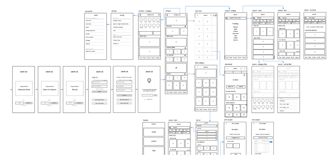
Wireframes
Design Challenge Example

Previous Experience In Coupon Order Pages
There are two types of coupons on the site, Print-at-home coupon - user would be able to download the PDF and print. Mail-to-home coupons - user will get the coupons at home after the business send them by mail.
There were two main issues in the previous experience:
1- Users didn’t know after they click the “Get My Coupon” button, they would be able to collect both printable and mail coupons and see the instructions on the following screen. Users are confused about how to collect their Printable coupons since the “Get My Coupons” button placed next to the “Mail-to-home” coupons description.
2- The order confirmation page didn’t group related information together properly, e.g Mail-to-home coupon selections and instructions, which create a negative experience for users try to understand the information.
Our customer service team received a high volume number of calls due to these two issues.
UX Solution

The primary goal for users after choosing their favourite coupons is to get their selected coupons as fast as possible. The design goal of this experience is to help users complete this task quickly and efficiently. And also help businesses give users positive psychological feedback, in term of creating a long lasting relationship to keep bring users back to the site.
In design solutions, We first separated the collection of printable coupons and mail coupon flow designed each separately. Then we reevaluated the information to reorganized design elements emphasis to create a clear visual hierarchy with a focus on the task.
Interface Solutions

We have three containers on the page in order to separate each coupon type, since the collection flows are different. When users land on this page, we would like them to see the there types of containers at one glance without scroll down too much on-page. Hence we need to set a maximum height for each container.
For each container, multiple coupons will be added into it, users could scroll to browse, so how to balance the size and behaviour of each container and leverage the overall height is the real challenge. We proposed several UI patterns to try solving this challenge. After we did the user test we finalized the outcome. Have the email or address on top of each container giving users an indication about where the coupon will go, also keep the main CTA button on the right, try to guide the user to take the next action.
Final Look
Previous UX


New Design


Design System

🚀 Launch Day :)

🌟 Achievement


